When it comes to mobile app navigation, designing an accessible experience is crucial for all users. In the realm of technology, apps, and smartphones, even seemingly minor design choices can significantly impact usability. By incorporating touch-friendly elements, clear labels, and responsive layouts, you can enhance your mobile app navigation. But there’s more to consider to ensure everyone can navigate your app seamlessly. Let’s explore the key practices that can elevate your mobile app navigation’s accessibility, making sure your app stands out in the competitive software landscape.
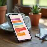
accessible mobile app navigation (image: Abwavestech)
When designing touch-friendly navigation for smartphones and apps, it’s essential to ensure that all interactive elements are easy to tap. Make sure buttons and links are at least 48×48 pixels to minimize mis-taps and improve the touch-friendly navigation experience.
Keep a 32-pixel gap between touchable elements to enhance usability and prevent accidental clicks. For optimal touch-friendly navigation, position critical navigation items near screen edges, making them easily accessible for one-handed users.
Consider adding tactile feedback, like vibrations, to confirm user actions in touch-friendly navigation. Lastly, design menus and navigation structures that fit thumb reach, placing key elements within the bottom third of the screen for optimal accessibility.
These touch-friendly navigation practices will significantly improve the overall user experience in technology, apps, and smartphones.
Implement clear and consistent labels
To craft an effective mobile app experience, it’s vital to implement clear and consistent labels for interactive elements. Descriptive labels like “Subscribe to Newsletter” or “Add to Cart” are essential for helping users quickly understand their options. This is particularly important for those using screen readers.
Aligning form labels with their respective fields significantly enhances accessibility, making it easier for visually impaired users to navigate. Consistency in terminology and style reduces confusion, allowing users to predict button and link functions effectively.
By conducting regular user testing, app developers can identify unclear labels and make timely adjustments. This proactive approach not only boosts accessibility but also enhances user satisfaction, ensuring everyone enjoys a seamless experience while navigating your mobile app.
Use visual feedback and affordances
Effective navigation in mobile apps relies heavily on visual feedback and affordances. These features provide users with critical cues about interactions, making mobile app navigation more intuitive.
Clear visual feedback, such as color changes or animations, enhances user confidence and control when navigating mobile apps. Consistent styles and state changes for interactive components ensure users understand how to use mobile apps effectively.
Adhering to WCAG 2.1 guidelines guarantees that users with disabilities receive the necessary cues, significantly improving accessibility in mobile apps. Utilizing a minimum text size of 16px enhances readability, while distinct focus indicators for keyboard navigation further promote inclusivity.
Ensure adequate touch target sizes
In the world of technology and mobile apps, ensuring adequate touch target sizes is essential for seamless user navigation. Touch targets, such as buttons and links, must be at least 44×44 pixels to accommodate a wide range of users, including those with varying levels of dexterity. This size helps improve user interaction and satisfaction, making your app more accessible to everyone.
When designing your app, remember to maintain a minimum spacing of 8 pixels between touch targets. This spacing helps prevent accidental clicks and enhances the overall user experience, which is critical in app development.
Placing crucial touch items in the bottom third of the screen is another effective strategy, as it aligns with users’ natural thumb reach, making one-handed operation much easier.
Additionally, it’s important to make interactive elements visually distinct. This not only improves recognition but also aids users with visual impairments, further enhancing accessibility.
Regularly testing your app with real users is a key step in identifying and resolving any potential issues related to touch target sizes. By focusing on touch target sizes, you can create a user-friendly interface that boosts user satisfaction and engagement.
Optimize navigation for speed
In the world of mobile apps, optimizing navigation for speed is crucial. Users expect fast and efficient experiences, so ensuring your app’s navigation is swift is essential.
Use clear visual cues to indicate menu states, which helps users understand whether they’re open or closed. A straightforward menu structure allows users to move quickly through app layers, reducing search time.
Prioritize quick loading times, as users tend to abandon apps if delays exceed two seconds. Consistency in design patterns across the app enhances familiarity and streamlines navigation.
Remember, balancing speed with functionality is key—avoid overly complex menus that can frustrate users and slow down their experience.
Incorporate responsive layouts
Seamless navigation is crucial for delivering an exceptional user experience, but it’s equally vital that your app’s responsive layout adapts to various devices.
Responsive layouts ensure your navigation appears flawless on smartphones, tablets, and larger screens. By implementing flexible grid systems, you can dynamically adjust navigation elements, maintaining a consistent user experience.
Incorporating scalable images and vector graphics prevents pixelation and enhances visual accessibility. Testing your navigation across different devices helps identify layout issues, ensuring touch targets remain accessible.
By prioritizing user-centric design, you allow elements to rearrange or resize without losing functionality, improving accessibility and engagement for all users.
Test with users for accessibility
To ensure your app is truly accessible, it’s crucial to test it with real users, particularly those with disabilities. Engaging these users in usability sessions helps identify barriers and gather diverse feedback on the effectiveness of app navigation.
Utilize accessibility testing tools like Lighthouse and Axe to simulate interactions with assistive technologies, ensuring your app’s accessibility features are optimized. Conduct real-world validation by having users navigate your app’s features, assessing the intuitiveness and ease of use.
Gather their insights on navigation labels, button sizes, and touch targets to enhance clarity and accessibility. Regularly incorporate this feedback into your design iterations, creating a more inclusive navigation experience that benefits all users and aligns with accessibility standards.
Conclusion
Enhance your mobile app navigation by implementing these seven best practices, which can significantly boost accessibility for all users. By designing touch-friendly elements, using clear labels, and ensuring adequate touch target sizes, you create a more inclusive app experience. Don’t forget to optimize your mobile app for speed and position critical items within easy reach on smartphones. Regular user testing of your app will help you identify any lingering issues. By prioritizing accessibility in your app, you’re not just improving usability—you’re welcoming everyone into your software. Remember, seamless mobile app navigation is key to success in the technology landscape.

")